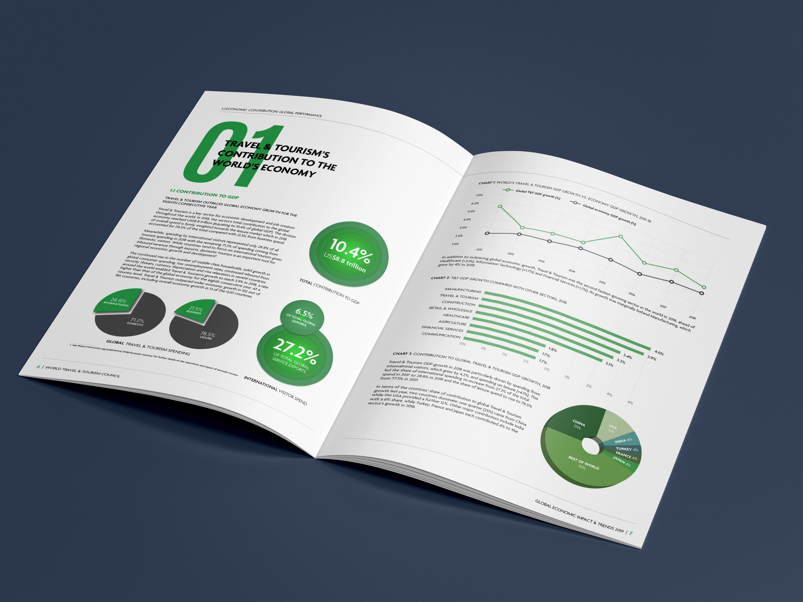
Lots of icons to produce and huge number of charts and tables had to be rebuilt and styled in Adobe Illustrator in a short space of time. I was pleased that the final result was easy to browse and clear and that they have continued to use my GLTR logo since the report was published.
We decided to avoid green as the main colour for the report as most of their documents end up with that fairly obvious choice! I designed it in the landscape format, primarily for screens.
